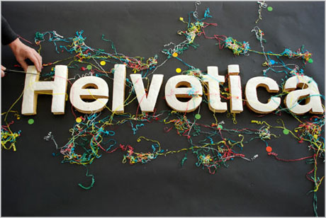
I wish Blogger gave Helvetica as an option so I can write this review of Gary Hustwit's documentary, Helvetica, using that typeface. I'm surprised it's not an option since it is so ubiquitous, and it is Helvetica's omnipresence that Hustwit dissects in this documentary. Helvetica is everywhere even if you don't realize that the typeface you're looking at is Helvetica--American Airlines, Crate & Barrel, American Apparel, Target, Staples, and countless more--all use Helvetica. The film charts Helvetica's fifty year history, from a Swiss font and a favorite typeface of Modernist designers to its rejection by Post-Modernists to its modern day resurgence as designers reinterpret the uses of the font.
To do so, Hustwit interviews quite a few designers, who I assume are legends in the field, and they discuss their relationship to Helvetica. Some embrace it as a versatile font that suggests sober efficiency when used one way and cool stylishness when used another. Think of its usage on IRS tax forms and subway signs and then compare it to, say, an American Apparel ad or some art poster. Others, though, mostly designers who came of age during the Vietnam era, view Helvetica as a "corporate" font, a typeface devoid of identity and meaning. They point to the fact that corporations overwhelmingly use Helvetica as proof that it's fascist and needs to be overthrown. One designer only half-jokingly correlates the use of Helvetica to sponsoring the Vietnam War. Then Helvetica comes roaring back as designers find ways to give it new connotations and uses. And with more self-taught designers, it has again become ubiquitous. The thesis of the film is that Helvetica may well be the perfect font. It is simple, clean, and versatile. Even those who hate it do so because of its usefulness.
Helvetica is a very enlightening film and it's fascinating to realize that things we barely give any thought to really convey a lot, that the visual medium is so strong, prevalent and effective that a quick glance is enough to send us a message. Signs, signs, everywhere a sign! The film stretches itself to be a movie, though, and at times its editing style borrows too much from the essence of its subject--too cool and placid. Still, it's an interesting topic and I can't wait for the sequel. Times New Roman? Comic Sans?

No comments:
Post a Comment